I was researching about what happens if you declare two “conflicting” positions for absolute or relative elements. So I found this great article about conflicting absolute position. After some tests, I discover a good way to center elements vertically or horizontally without know his dimensions.
If you have the following HTML / CSS:
[jsfiddle url=”http://jsfiddle.net/TCQcc/2/” height=”300px” include=”html,css,result”]
It’s a fluid layout with a div fixed dimensions. The example above show the minimum requirements to positioning a element in viewport or relative to a parent div.
You just need two of the 4 valid positions to allocate a element on screen, they are top, left, bottom and right, so you just need top and right, top and left, bottom and top and bottom and left. With width and height you can specify the element dimensions as usual.

But if you declare top and bottom, or left and right? As explained in conflicting positions article, since IE7, they consider the two positions and the height is filled of the remaining space between two positions.
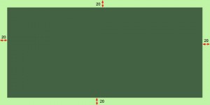
This mean that if you declare 20% of top, right, left and bottom you will have a behaviour like a border, with the width and height filling the content until the edge.
If you go extreme, and put two conflicting positions to 50% you will have:
[jsfiddle url=”http://jsfiddle.net/xb8Hp/” height=”300px” include=”html,css,result”]
So, if you declare the four rules for position with 50% the element will have one pixel, just because of the border. So, with this, if you declare less than 50% they will keep centered horizontally and vertically and the height and width will be guided by the remaining values of percentage. Width 42%, for example for top and bottom, the height will be 16% (8% twice) of the parent element or the viewport. You can see working below:
[jsfiddle url=”http://jsfiddle.net/xkE7A/” height=”300px” include=”html,css,result”]
So, this way you can center fluid elements and they remaining with the same alignment proportions as you resize the viewport.
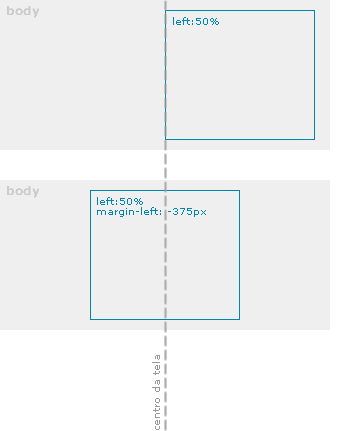
For me, even seens obvious, it’s a great way, cause I always used methods like negative margin and jQuery for center elements.
